Doctor Doom and the Art of Comic Book Illustration
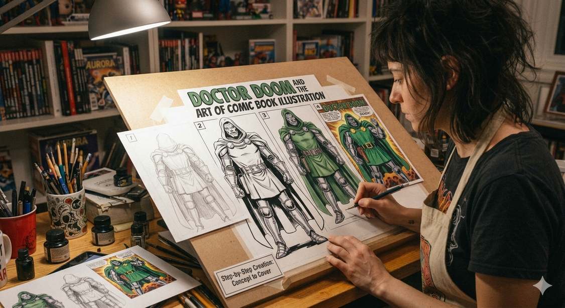
Some comic-book characters are remembered for their stories, whereas others become instantly recognizable because of the way they look. Doctor Doom fits perfectly in the second group. His metal mask, hood, armour and sweeping cape create a unique image that has remained familiar across generations of Marvel Comics.
But creating an iconic character takes a lot of work on shape, posture, line work, colour, lighting and composition to communicate personality before a character even speaks. When discussing Doctor Doom and the art of comic book illustration, these visual choices matter even more because his masked face leaves artists with fewer conventional ways to show emotion.
Scroll down to learn how comic illustrators turn a character concept into someone who feels powerful and alive on the page.
What Makes Doctor Doom So Visually Memorable?
Doctor Doom is the kind of character who can be recognized from a silhouette alone because of the details that can create an instantly identifiable shape.
Readers can usually tell who has entered the scene even without a speech bubble or a name printed on the page.
Doctor Doom was created by Stan Lee and Jack Kirby and was first seen in The Fantastic Four #5 in 1962. His visual identity has remained remarkably consistent while different generations of artists have interpreted the character in their own ways.
That recognition is one foundation of successful comic book character illustration. Doctor Doom’s design does much of that work before he says a word.
The result is an interesting example of how a strong original design can survive changes in artistic style. Here is a detailed overview of everything associated with this artwork
Want to Learn More About Character Illustration?
Discover how professional character illustration brings personality, emotion, and visual identity to comic books, children’s stories, and other illustrated projects.
The Mask Does More Than Hide a Face
Doctor Doom’s mask is the most important element of his visual identity.
Its metallic surface gives his face an inhuman quality, while the limited facial expression forces artists to communicate emotion through other parts of the character.
Some tips for illustrators include:
- Altering Doom’s head angle, posture, hand position, or surrounding shadows can actually make the character more dramatic.
- A close-up of Doom staring directly at another character can feel threatening because the reader cannot easily interpret what is happening behind the mask.
- A tilted head can suggest curiosity, whereas a lowered hood and heavy shadow can make him appear even more imposing.
The mask becomes a storytelling tool instead of being used simply as a costume accessory when you think about Doctor Doom and the art of comic book illustration.
Armour Creates Weight and Presence
Doctor Doom’s armour presents another challenge for illustrators.
Metal should look different from fabric or the skin. It needs convincing edges and shadows to communicate its material. At the same time, the character cannot appear so heavily armoured that his movement becomes visually awkward.
Good comic-book artists solve this by simplifying complex surfaces into strong shapes.
Tips include:
- The plates on Doom’s arms, legs and torso can be exaggerated through line work and shadow.
- Small highlights can suggest polished metal while darker areas give the armour depth.
- The artist can also bend or overlap the armour forms to make the action easier to read when the character moves
This is where comic book illustration differs from simply drawing an accurate costume. The goal is to make the armor convincing while keeping the character readable in a fast-moving sequence.
Bring Your Comic Ideas to Life with Professional Illustration
Looking to turn your story into engaging visuals? Explore our comic book illustration services to transform your characters, scenes, and storylines into compelling comic artwork.
The Cape Changes the Entire Silhouette
Doctor Doom would still be recognizable without his cape, but with it, his visual presence becomes much stronger.
The cape introduces a large, flowing shape that contrasts with the armour’s rigid geometry.
That combination gives artists two different visual languages to work with: hard metal and soft fabric.
- During a quiet scene, the cape can hang heavily behind Doom, which makes him appear formal and imposing.
- It can also spread across the panel and increase the sense of movement during an action sequence.
Artists can also use the cape to frame the character.
- A dark or sharply outlined cape can surround the armour and mask, drawing the reader’s attention towards Doom’s upper body.
- The cape can expand his silhouette and make the entire composition feel more theatrical when he stands on a balcony or a throne.
These little details tell how the Doctor Doom and the art of comic book illustration has been connected since forever. Illustrators have so many options for adding details and
How Artists Use Body Language
Body language is very important as Doctor Doom’s face is hidden.
He is rarely drawn with the casual posture of an ordinary person. Artists often give him a straight back, squared shoulders and deliberate movements.
The pose can communicate authority even when he is standing still.
Hands also require some extra attention.
- A raised hand may indicate that Doom is commanding someone.
- The clenched fist can communicate anger without requiring an exaggerated facial expression.
- One hand resting on a piece of technology can suggest control and confidence.
These details demonstrate an important principle of comic book illustration in Canada which is that character personality is not confined to facial expressions.
A strong artist can communicate arrogance, anger, confidence or menace through the way a character occupies space.
Why Jack Kirby’s Approach Still Matters
Jack Kirby’s artwork had a major influence on the visual language of Marvel Comics, and his original interpretation of Dr. Doom character illustration established many of the elements that later artists would preserve.

Want to Explore Dr. Doom Character Illustration?
Discover how Dr. Doom character illustration combines distinctive costume design, strong silhouettes, expressive details, and visual storytelling to create an unforgettable comic character.
Kirby’s work often emphasized bold shapes and dramatic poses. His characters could look larger than life without becoming difficult to read.
That approach was particularly effective for Doctor Doom.
The character’s armour, cape and mask gave Kirby plenty of strong geometric forms, while Doom’s poses allowed him to dominate a panel.
The design also worked well against the more dynamic shapes of the Fantastic Four.
Later artists could therefore reinterpret Doom without needing to redesign him from scratch.
Different Artists, One Recognizable Character
One of the most interesting aspects of comic book illustration is seeing how different artists interpret the same character.
- Some artists may make Doctor Doom’s armour appear extremely detailed and mechanical. Others may simplify the design and concentrate on his silhouette.
- One illustrator may emphasize his physical strength, while another may make him appear more mysterious and regal.
Colourists also influence how the character feels.
Metallic greens, grey armour, dark shadows and the contrast of the cape can create a distinctive visual palette. Changes in lighting can make the same costume look completely different from one panel to the next.
At the same time the essential ingredients remain recognizable.
The bold shapes and striking colours associated with comic characters can also translate effectively into pop art illustrations, where familiar figures are often reinterpreted through simplified forms and strong visual contrasts.
Bring your ideas to life with eye-catching pop art illustrations featuring vibrant colors, bold compositions, and distinctive visual styles for your creative projects.
Composition Makes Doom Feel Larger
Doctor Doom’s impact is not only about how he is drawn. It is also about where he is placed.
An artist can make Doom feel powerful by
- Positioning him above another character
- Placing him in the centre of a wide panel
- Surrounding him with empty space
A low-angle view can make him appear physically imposing, while a close-up can make the mask feel more intimidating.
Before a finished comic page is drawn, storyboard illustration can help artists plan character positioning and the flow of action.
Panel size matters too.
A small appearance in a crowded action sequence may make Doom feel like part of a larger conflict. A full-page image devoted to him gives the character much greater visual authority.
This is one reason comic illustration is such a sophisticated storytelling medium. Artists are controlling not only the character’s appearance but also the reader’s attention.
What Can Modern Artists Learn From Doctor Doom?
Doctor Doom offers several useful lessons for anyone interested in comic-book illustration.
- First, a character needs a strong silhouette. A recognizable outline gives the design a better chance of working across different panels and artistic styles.
- Second, visual details should support personality. Doom’s mask, armour and cape are not random decoration, as they communicate authority and mystery together.
- Third, limitations can encourage creativity. Because Doom’s face is covered, artists have to find other ways to show emotion and intention.
- Lastly, consistency matters as different artists can bring their own techniques to a character while preserving the visual features that make the character recognizable.
Readers who want to find a book illustrator should also keep these things in mind during their search process. An experienced designer will mention all these points during the initial consultation, which will clearly indicate their expertise.
Looking to Find a Book Illustrator for Your Story?
Discover helpful tips on how to find a book illustrator, evaluate different illustration styles, and choose the right illustrator to bring your story and characters to life.
FAQS
- Why does Doctor Doom wear a mask?
Doom’s mask is connected to his appearance and identity within the character’s story, but visually it also gives artists a way to create mystery and communicate emotion through posture, lighting and body language. - Has Doctor Doom’s costume changed over the years?
Yes. Different comic artists have adjusted details of his armour, mask, cape and technology over the years. But the core visual elements have remained recognizable. - Why is silhouette important in comic-book character design?
A strong silhouette allows readers to recognize a character quickly, even when the figure is small or is being shown in a dramatic action pose.
Wrapping Up
Doctor Doom shows that an iconic comic book character is more than just their costume. The design offers so much to work with for telling the story through outlines, posture, lighting, textures, composition, and movement.
The mask generates mystery; the armour creates mass and structure; the cape generates movement, and the posture generates authority regardless of what his face conveys. This describes the relationship between Doctor Doom and the art of comic book illustration, allowing many generations of artists to recreate the iconic figure without losing the identity created years ago.

Emily is a professional and creative strategist behind BookIllustrator.ca, a leading illustration agency dedicated to delivering premium book illustration services in Canada and internationally. With a strong foundation in storytelling and visual communication, she works closely with expert book illustrators to transform manuscripts into visually compelling, market-ready publications.