Designing Villainy: Dr. Doom Character Illustration Breakdown
These words for Victor Von Doom: Power. Perfection. Pride.
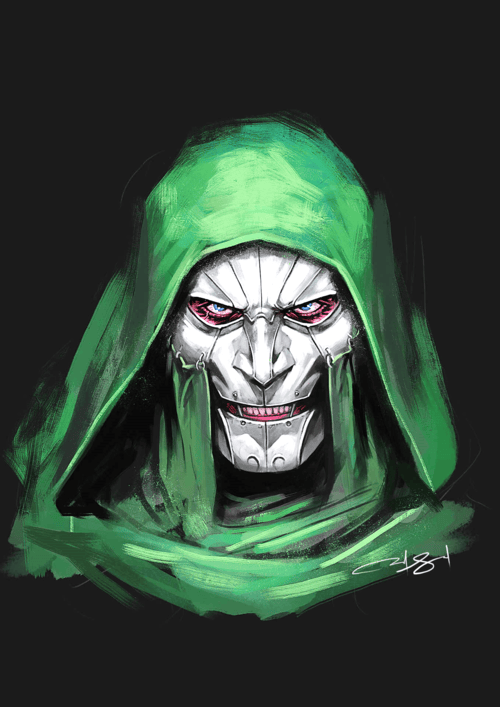
These traits define him as a person, hiding more than just the scar behind his mask, and as the biggest, cold-blooded enemy of the Fantastic Four. Moreover, his illustrations in the comics and movies show that he is intellectual, born to dominate, and a slave to his own ego.
Orphaned at a very young age, this little boy realized he was gifted and was determined to reshape his fate. Perhaps this is why his character design deserves a closer study. So, welcome to Dr. Doom’s character illustration breakdown, where we explore how shape, texture, and posture turn one man’s pride into visual fear.
Anatomy of Dr. Doom’s Character as a Villain
- Quick Review of His Early Life
Victor Von Doom, an ill-fated child, had a rough upbringing in Latveria. This small, fictional country, which is Victor’s hometown, somehow transformed into a global powerhouse under his later rule. So, maybe he wasn’t so unlucky after all.
Speaking of childhood, his mother tried her hand at dark arts and got herself killed. His father, too, didn’t last long, and isolated him as a kid. But Victor was driven by pain, and he pushed very hard to get himself enrolled in a U.S. university. Once accepted, he shifted into a room with Reed Richards (one of the four Mr. Fantastic).
- When the Tables Turned
Then comes the turning point where Victor builds a machine to find his mom’s soul in hell. Reed tries to tell him he got the math wrong, but his ego is like, “Nope.” Hence, obviously, the experiment goes sideways, the machine explodes, and he ends up with a minor facial scar. This is the point when he gets kicked out, heads to the mountains, and studies sorcery with monks.
Somewhere along the way, he decides the best face-cover is molten metal. Was there any logic behind this idea? Not necessarily. It was rather a rushed decision that later made him regret it, inconsolably. Fast forward to when he was coming back from the monk school with a new magical power and even more arrogance.
This means Victor is not himself anymore; he has become Dr. Doom – a super villain with a God complex. So, as expected, he takes over his hometown and turns it into a dictatorship. On the other hand, he continues to blame Reed Richards for the explosion that scarred him and holds a lifelong grudge like it’s his most prized possession. This is the rivalry that defines his villain arc across Marvel, and it is the main reason why he looks so dreadful in that mask.
- A Description of His Character
Now, if we look closely at how a book illustrator CA analyses Dr. Doom’s character before drawing him, here is how it would look.
- The Armor
First of all, this guy is rarely beaten. He has had clashes with everyone from Iron Man to Spider-Man and from Hulk to the X-Men, but he somehow always manages to escape with his intelligent moves.
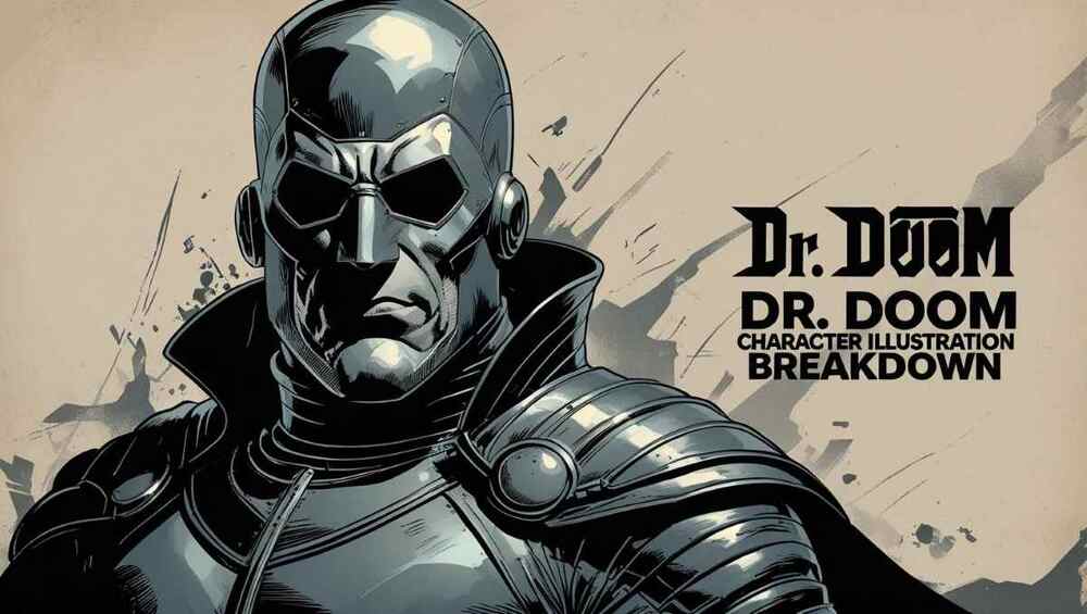
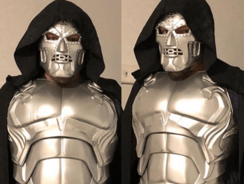
Hence, his chest armor was created to show his unbeatable powers. It was built to look solid and flawless, exactly like: nothing can break it. The artists also often highlight his firm shape to reflect how strong, untouchable, and always-ready he is in any fight.
. The Mask
Next, he is a classic example of villainy done right. The features of his mask, his hollow eyes, and the shiny green colour are equally terrifying. Even his smartness is often very unsettling for the readers. This is why the designers got their character to cover his face with a mask. It was never to hide his scars but to keep the emotions and empathy permanently locked out.
- The Cape
Another major part of his villainous costume is the cape. It looks intimidating at first because it is often long, flowy, and designed to make him appear bigger and more powerful. Moreover, the deep green color adds a royal and serious vibe to the cloth, while the way it moves creates drama and control.
Perhaps this is why the character illustration company, which designed him, used the cape in his look. It was intentionally added to frame his body like a throne, making him seem like someone who commands attention and fear just by entering the room.
- The Gauntlets
Next are his gauntlets. Both of them are purposefully designed to look like the main lead and detailed. The graphic designers drew them with sharp lines and firm shapes to show how ever ready he is. In addition, if you pay attention, they do not look chunky or random at all.
Instead, they feel like an extension of his control. Especially, the smooth but heavy metal, which is used to draw every finger joint quite cleanly. As a result, Dr. Doom’s hands show strength, precision, and intention. Moreover, whether pointing at someone or raising a fist, the gauntlets make each move feel planned and dangerous.
- His Stance
Finally, we have his extremely commanding and arrogant standing posture. The way he stands tall, his style says everything without a word being said. For instance, he is usually shown standing tall with feet apart, back straight, and arms either crossed or tucked behind him.
This gives the impression to the reader that he is never in a rush. A little hard to believe, but yes, never a nervous moment. Therefore, the character design services used this exact posture to represent how he is above everyone else, both literally and figuratively. Furthermore, his stance feels like a challenge, making others seem smaller in comparison.
A Quick Guide About a Convincing Villain Illustration
Speaking of strong evil characters, for the character illustration, you need to hire someone very professional. Someone who can do justice to the plot and the author’s vision. Here are a few lessons about it.
- Silhouette
When drawing an anti-hero, the artist must keep in mind that the personality he is working on will forever be incomplete without an authoritative silhouette. Yes, it is true, and even Dr. Doom’s figure has one because it suited his tall height and wide-shouldered body.
Moreover, with a cape, an artist can represent bold, symmetrical outlines for the character. This helps in giving it an intimidating vibe. Thus, the details are important, and one should always try to keep the body posture upright and centered.
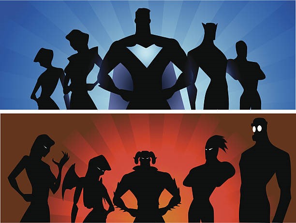
Apart from this, the overall shape should be solid and structured, implying that the evil person is very controlling and authoritative. In addition, no messy lines should be there, or else it will affect the dominance of the anti-hero in every frame.
This means you should make effective use of the negative space to let your sketch stand out. You can even use broad angular outlines to ensure that the figure is readable at thumbnail size.
- Armor and Texture
The second element is the armor, and it is not just there to protect the person from dying in the story. Instead, it is usually a part of their identity in all the character illustrations in Canada. So, as an artist, use smooth surfaces and sharp edges to reflect the villain’s need for order and perfection. Moreover, experiment with different textures to create subtle highlights and create a look of strength and confidence.
Moving on, you should make sure that the drawing has clean ridges and firm lines in all frames because they suggest the suit was purposefully designed. For instance, the attire will be suitable for both battle and intimidating encounters.
In addition, the armor you choose for your character should feel solid, signifying emotional and physical resilience, such as in Dr. Doom’s case. You should also take notes on how not to make your anti-hero person look vulnerable at all. For this, the tight symmetry and clean finish always come in handy. They perfectly communicate that the villain is a planner and always in control.
- Facial Expressions
Next, on the storyboard illustration, it is important to design the evil man’s mask and expressions precisely. The audience and the reader should not be able to see emotions in his eyes or any weakness or pain on his face. This little detail is very important and has the power to make or break a character. So, draw it as flat as possible, with zero expression.
In addition, leave a bit of mystery on the face for the reader to question. Other than that, make sure that the reader only has the villain’s posture, light, and shadow to rely on while trying to understand him. A quick trick is to focus on light placement and contrast instead of facial anatomy. The artists should also use the ambient blocking technique to add depth around eye slits and edges.
- Hands and Gloves
If you have noticed closely, Dr. Doom’s hands were designed to show control. Even his gauntlets were sleek, segmented, and firm. This shows that the artist should emphasise clean edges and precise finger joints when working on the character illustration of a villain.
Moreover, whether the figure is holding something or doing gestures, his or her hands should look like tools, not limbs. This reinforces his intellect and focus. In addition, any sort of wild movement can irritate the frame, so try not to include any.
Thus, as an artist, you should break the gauntlets down into modular shapes. Then start with sketching cylinders for forearms and boxes for knuckles.
- Body Language
A great villain does not need to move much to show his power. Even Doom’s posture was always firm, balanced, and confident. This means the artist has to position his figures with feet apart and arms either tucked or composed. It is important because loose or fidgety hands can give a poor impression.
Even surrounded by chaos, your character should stand as if it is no big deal. So, make sure that the illustrator relies more on gesture lines and line-of-action curves, even in static poses. This will help in emphasizing the strength and intention of the person.
The Frequently Asked Questions
- Why is Doom’s armor royal and intimidating?
His armor looks like a king’s battle suit as it is made up of polished metal, has a deep green cloak, and a few bold designs. Moreover, it is sharp and commanding, reminding everyone that he is both a ruler and a warrior.
- How does his mask show his personality?
His mask completely takes over his face, baring no sight of his emotions or weakness. Hence, he appears as a very cold character. As a result of this appearance, people become uneasy around him, reluctant to have any connection with Doom. So, the mask is less about protection and more about coming off as serious, calculated, and dangerous.
- What proves he’s a perfectionist?
He is a perfectionist as he left everything behind after a tiny facial scar. This proves that even small flaws bother him deeply. In addition, he constantly competes with Reed Richards, refuses help, and builds grand machines to prove he’s the best. Thus, his drive for perfection is very clear.
- How do kids and adults see his evil look differently?
According to the observations, kids often see Doom as cool because of his robot-like, villainous appearance and the strong armor with a dramatic cape. On the other hand, adults notice darker things such as no facial warmth, stiff posture, and cruel-looking eyes.
The Summary
The overall look of the evil figure, Dr. Doom, was designed with two things in mind: he is both a sorcerer and a scientist. Thus, the little details of his outfit had to be wisely chosen with the help of a professional. These people gave him an intimidating costume, bland facial expressions, and a commanding posture that spoke ‘I am not here to be your friend’.
As a result of this character illustration, the target audience was able to correctly perceive Victor’s character as a villain. Hence, the next time you are designing a wicked person’s outlook, make sure you pay special attention to the body language, stature, and expressions.
Emily is a professional and creative strategist behind BookIllustrator.ca, a leading illustration agency dedicated to delivering premium book illustration services in Canada and internationally. With a strong foundation in storytelling and visual communication, she works closely with expert book illustrators to transform manuscripts into visually compelling, market-ready publications.

